


The internet made everything look perfect. We wanted things to feel real again.
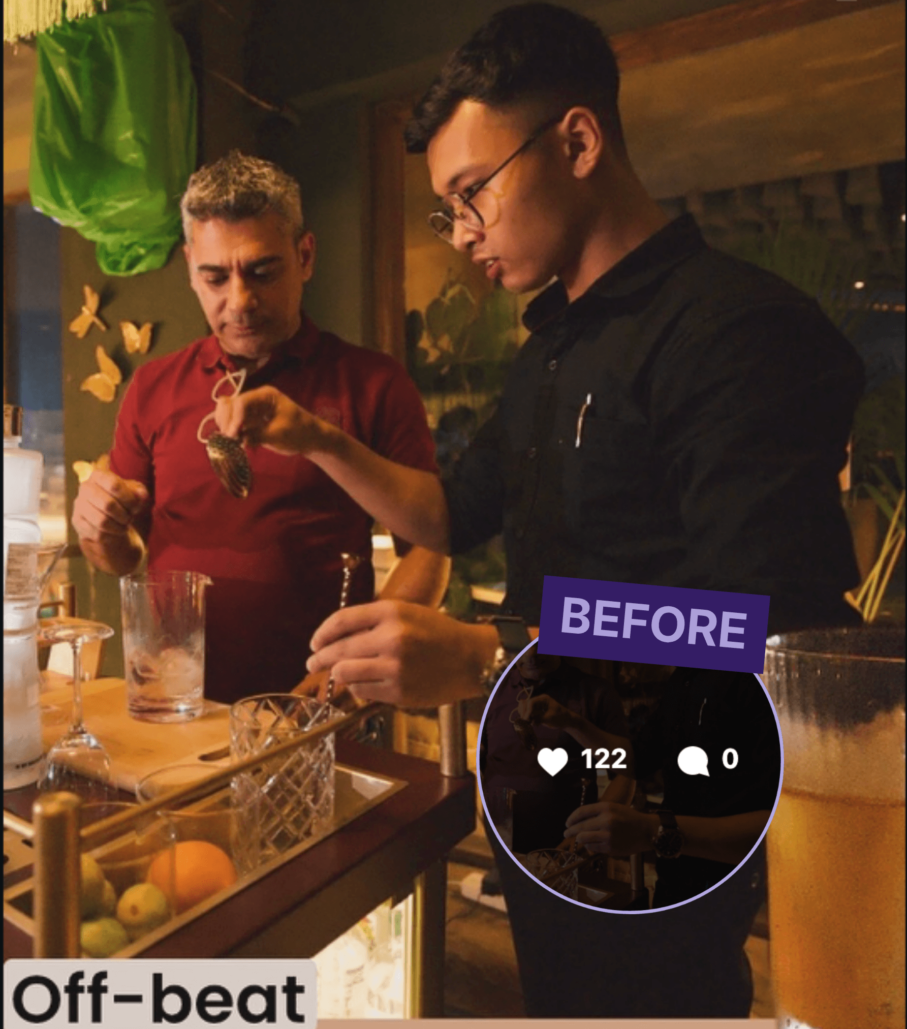
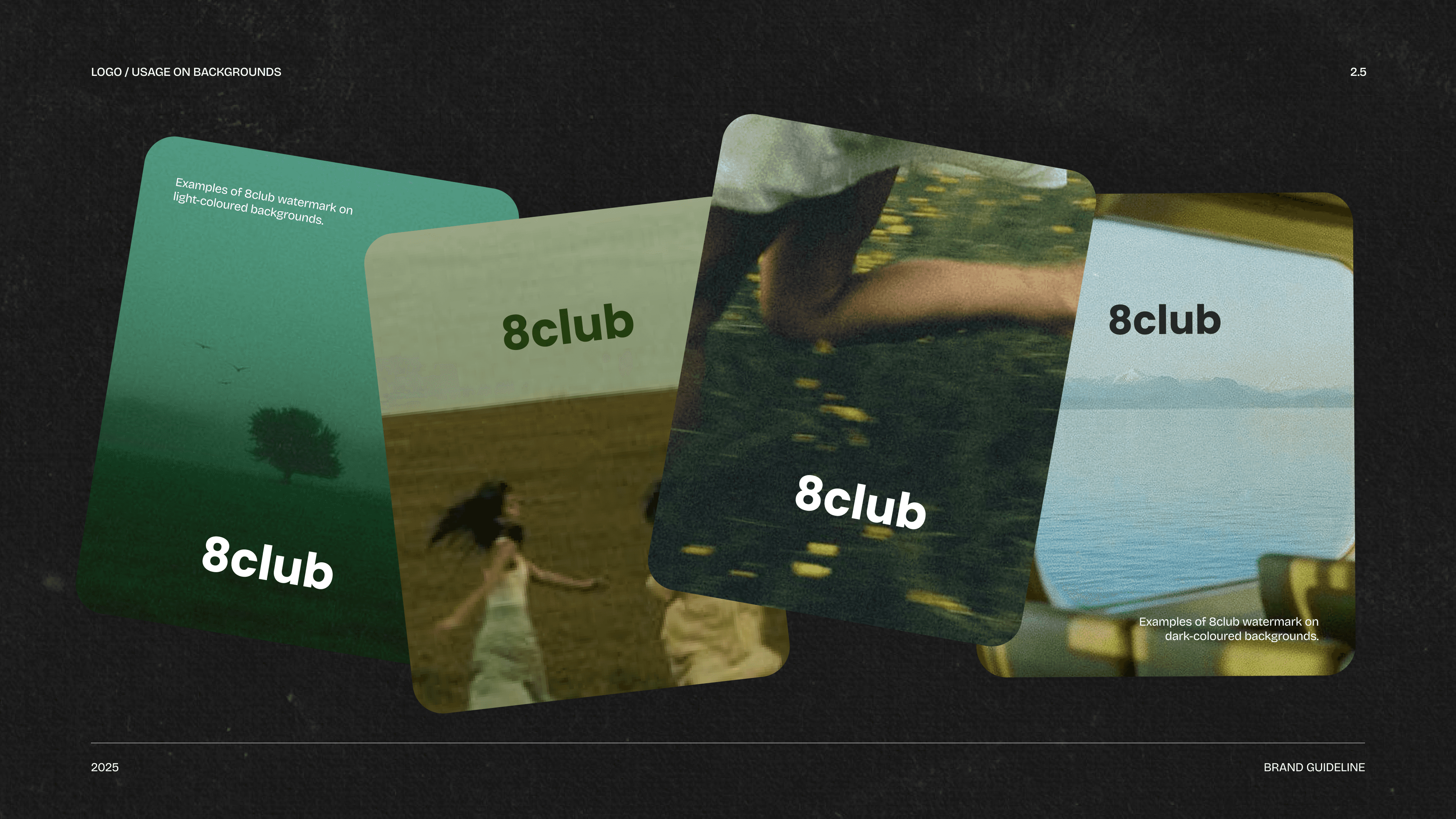
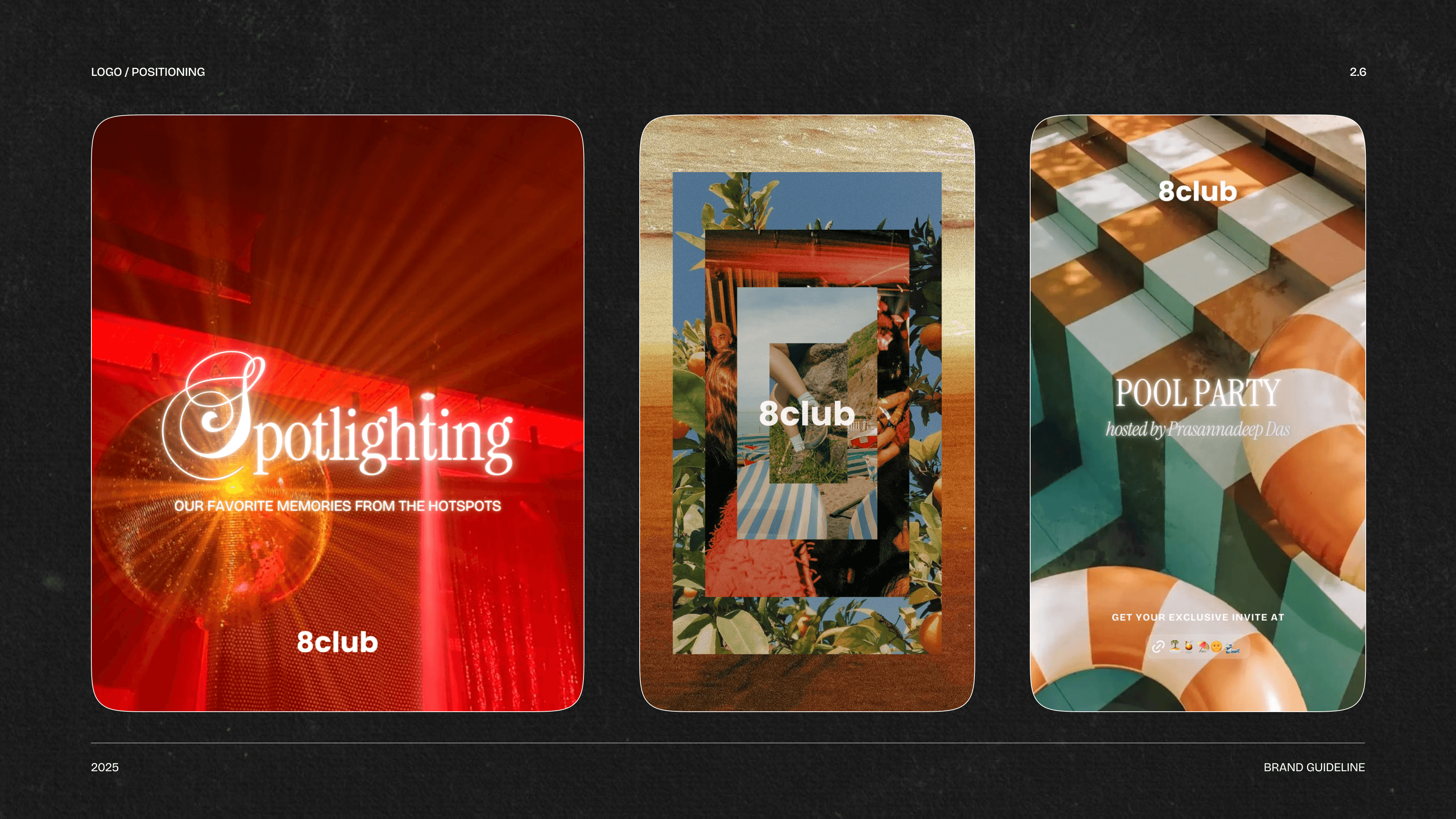
Earlier, the brand was optimised for clarity with focus on consistency. But real nights rarely look like that. So the visual language moved away from perfection and closer to memory. Grainy textures, warm flash photography, scanned objects, layered type, imperfect crops, accidental moments. The goal was to make it feel lived-in.
Organic follower growth
and brand visibility.
Increase in shares, saves &
community-led interaction.
Average engagement on
high-performing posts.

As the visual language evolved, the feed started feeling less like promotion and more like memory. Warmer photography, layered type, imperfect crops, flash-heavy visuals, and scrapbook-like carousels changed how the brand felt online - and people responded instantly.



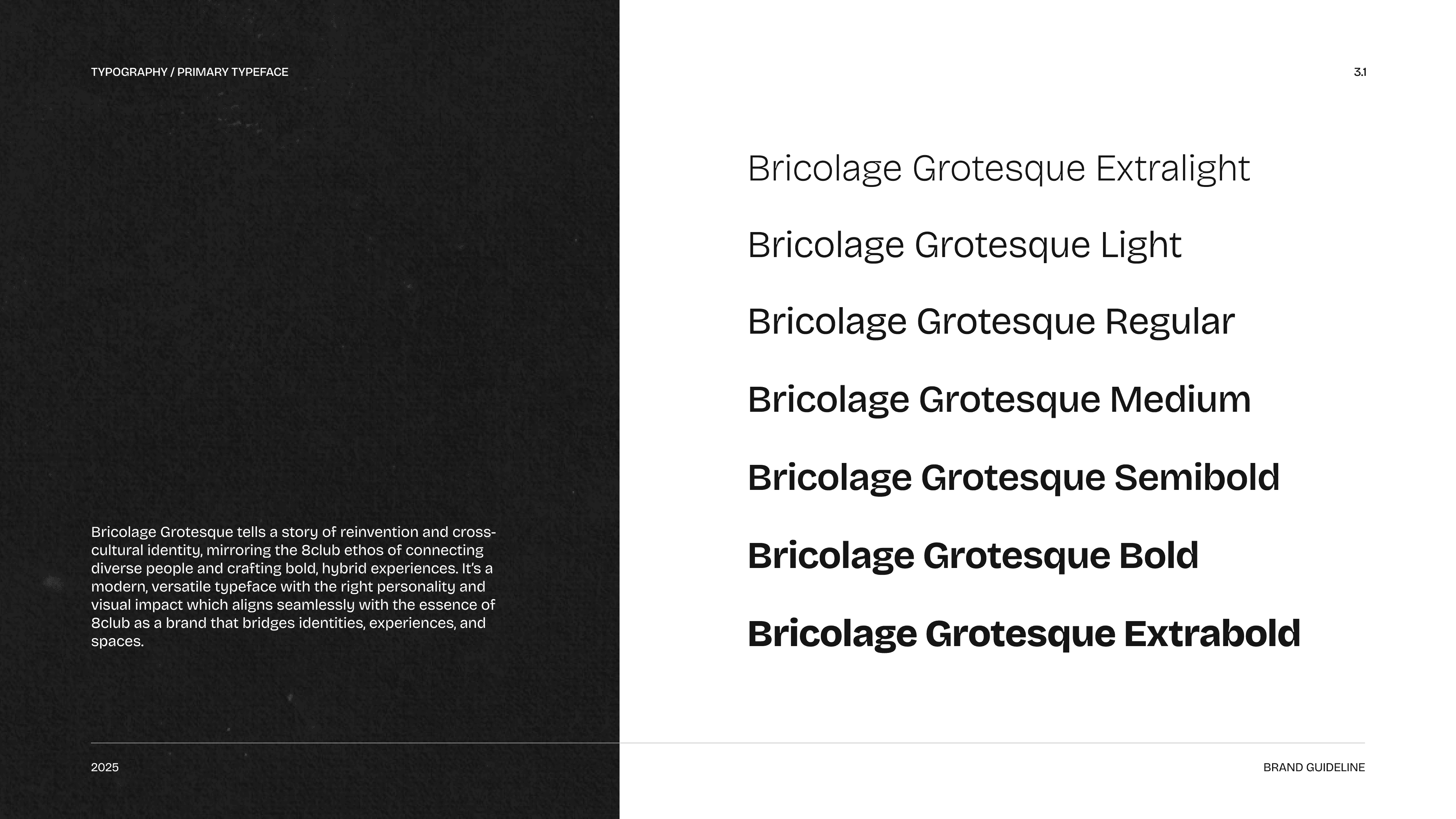
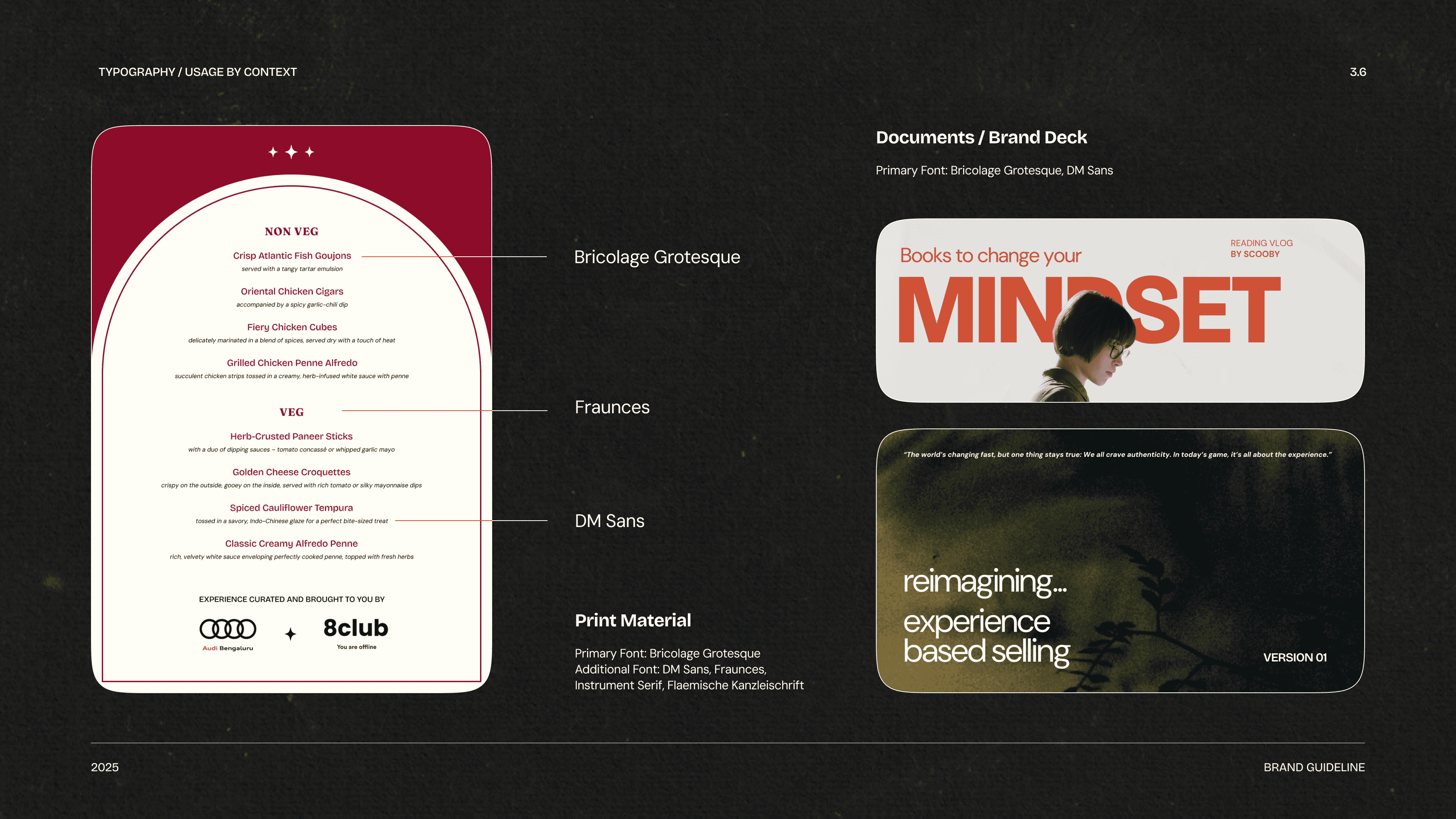
Typography carried a huge part of the mood.


The visual system was built more around feeling than strict consistency.
Purple naturally became the emotional center of the brand. Black, white, and sharp hits of orange helped create contrast while keeping the overall mood warm and recognizable. Textures felt aged. Gradients felt atmospheric. Typography stretched across layouts freely. Nothing looked overly rigid or locked into one structure.


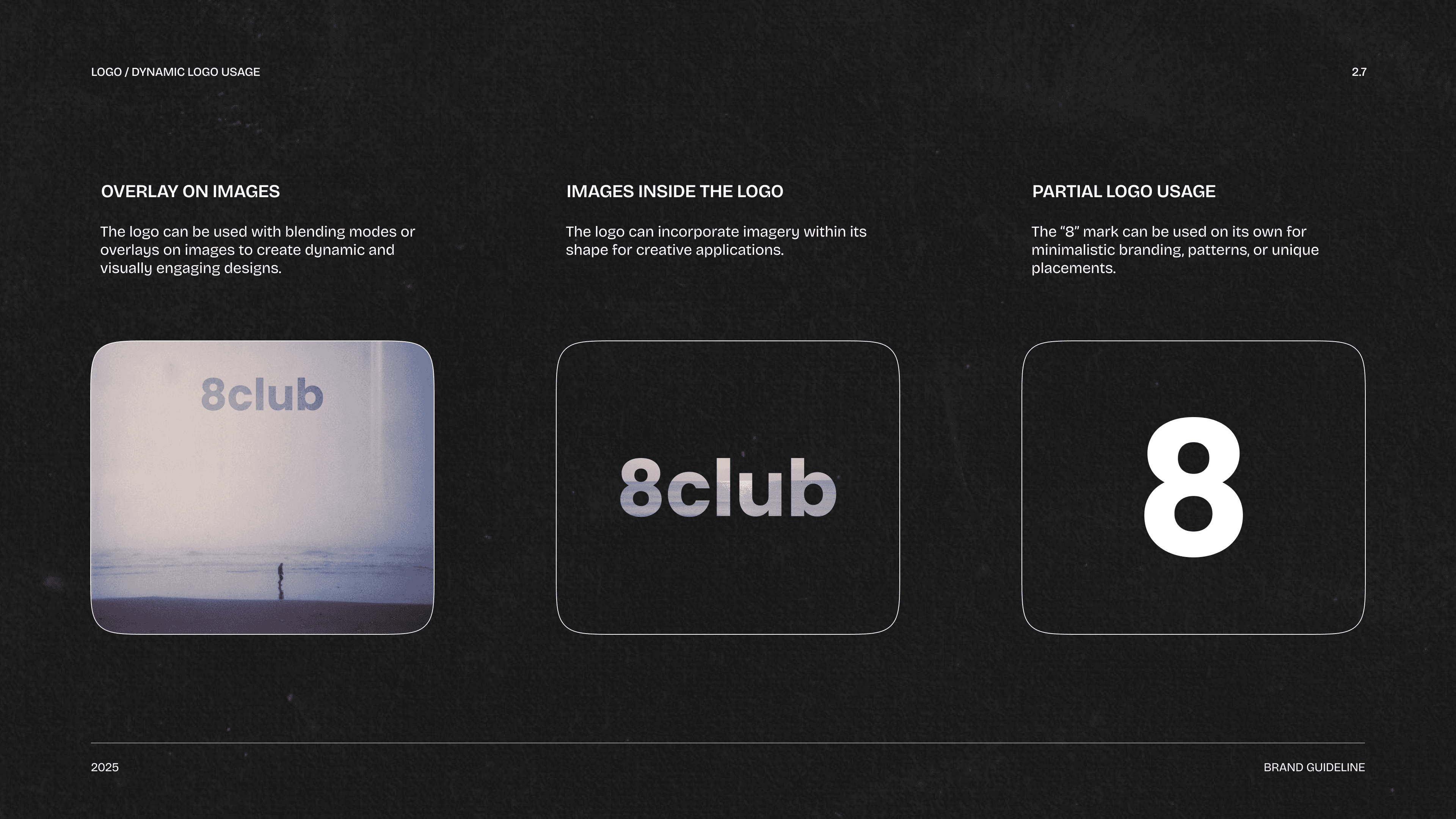
The guidelines became less of a rigid instruction manual and more of a way to preserve the brand's emotional logic. They documented typography, textures, movement, image treatment, colour relationships, layouts, objects, and tone of voice - not as fixed rules, but as recurring behaviours.
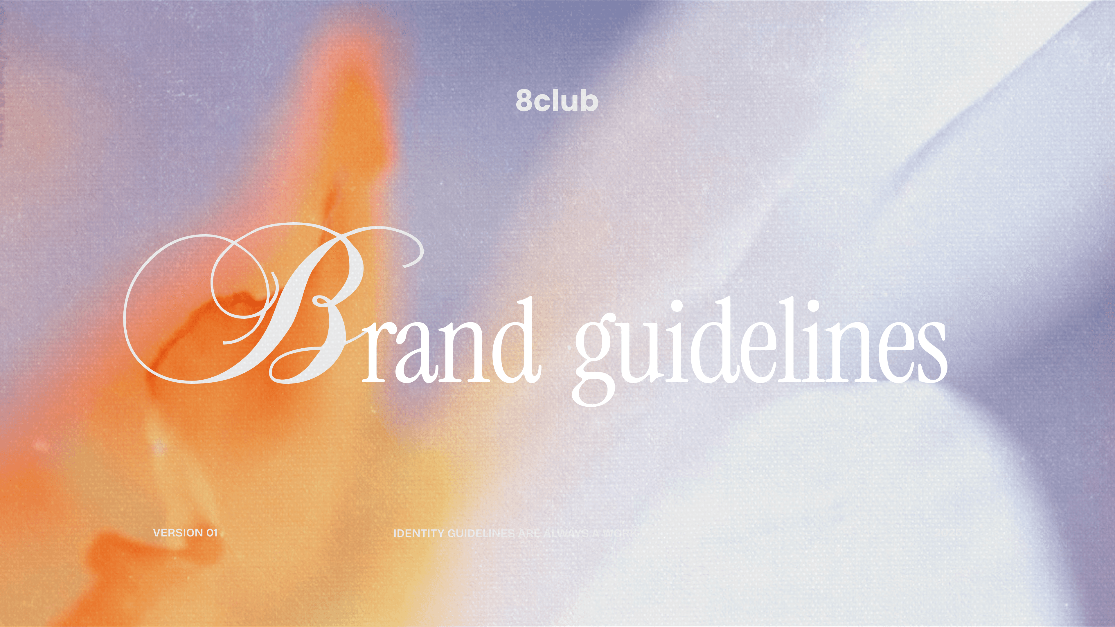


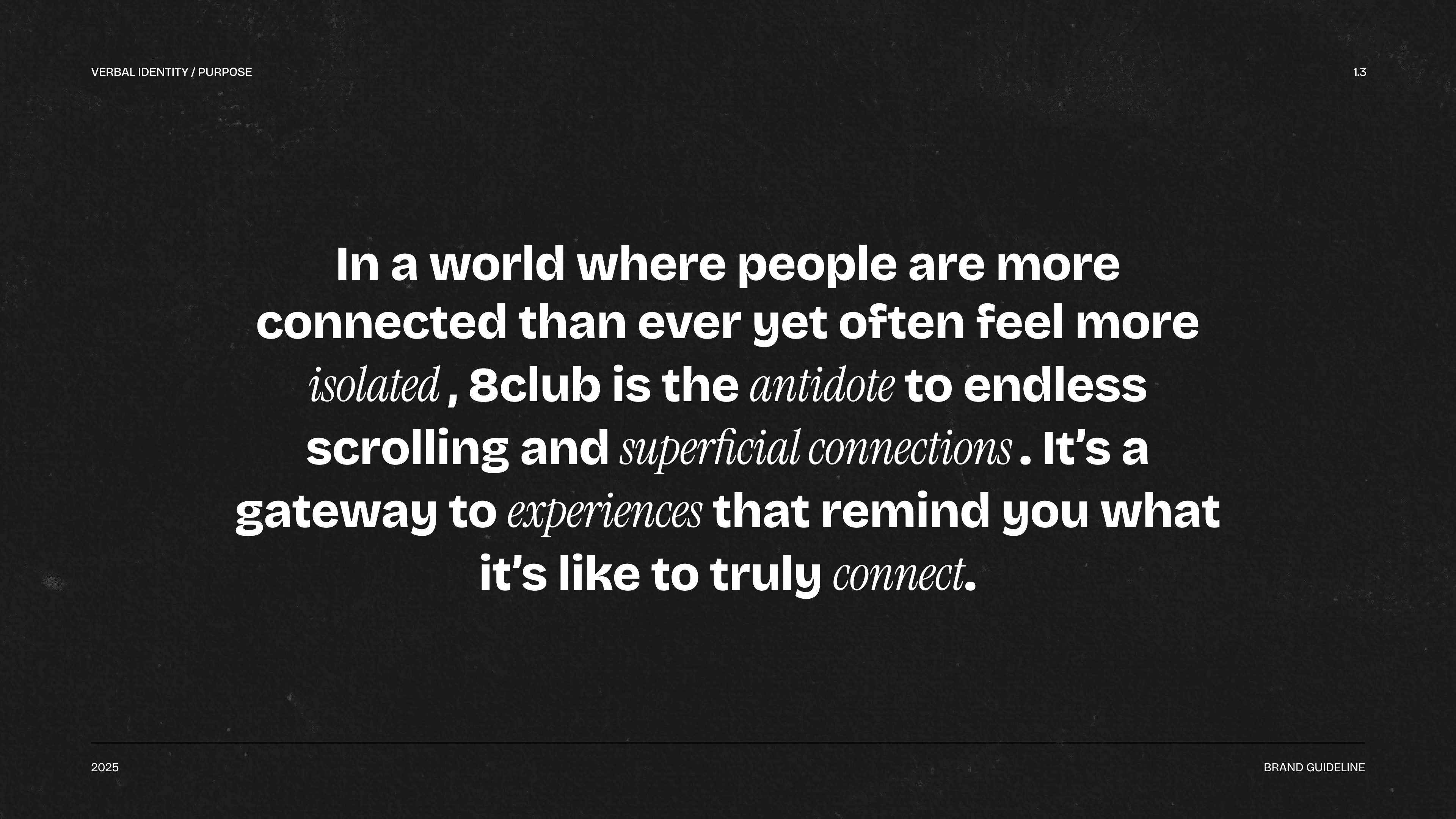












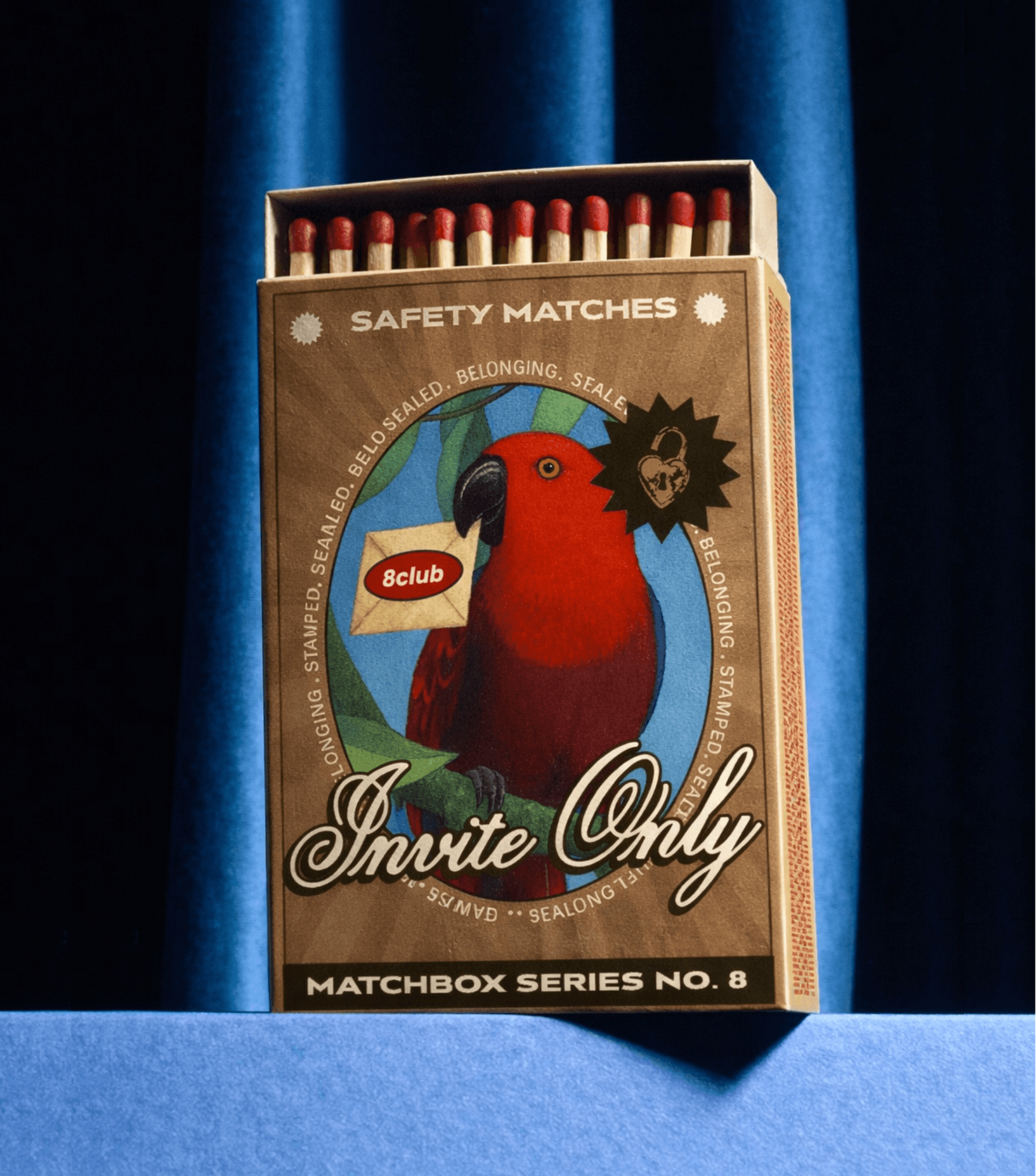
Eventually, the visual language started escaping the screen naturally.
Nothing was designed to feel overly polished or precious. The best pieces felt like things someone would accidentally keep in their room for months because they reminded them of a night, a conversation, or a person they met once and never forgot.

As the system evolved, it became more flexible too. Some campaigns felt chaotic and energetic, while others became slower, softer, and nostalgic. Certain visuals leaned playful and loud, others became quiet and intimate.
The consistency never came from repeating the same layouts. It came from the emotional language underneath everything - warmth in the imagery, movement in the compositions, imperfection in the details, and the feeling that real people existed behind the visuals.


8club was always about making going outside feel exciting again. Not in a huge dramatic way. In small human ways. Meeting someone unexpectedly. Staying for one more drink. Recognising familiar faces. Having stories to tell the next morning.
The identity simply grew around those moments.
The visual system was built more around
feeling than strict consistency.


