• Retro app screen mockup
  • Colorful interest tags UI
  • Social app phone mockup
  • Hotspot stamp grid layout
  • Dark mode states app screen
  • App screen collection
  • Phone on grass mockup
  • Outdoor activity default stamp
  • Social profile grid on phone
  • Default hotspot cards
  • Retro app screen mockup
  • Colorful interest tags UI
  • Social app phone mockup
  • Hotspot stamp grid layout
  • Dark mode states app screen
  • App screen collection
  • Phone on grass mockup
  • Outdoor activity default stamp
  • Social profile grid on phone
  • Default hotspot cards
Year

2024 - 26

Scope

Product Visuals, Visual Storytelling, Art Direction

Role

Visual Designer, Art Director

Can design make people care about experiences before they happen?

The visual direction explored how social experiences could feel more expressive, memorable, and emotionally charged through design.


Instead of relying on polished utility-driven aesthetics, the system leaned into collage culture, vintage memorabilia, editorial layouts, tactile textures, and imperfect cutout imagery to create a stronger sense of personality and social energy.


This case study brings together the visual systems created across the product, from collectable experience stamps and reimagined classical paintings to cinematic onboarding states, app store previews, and evolving cutout libraries, each designed to make everyday plans feel more personal, participatory, and worth remembering.

Year

2024 - 26

Scope

Product Visuals, Visual Storytelling, Art Direction

Role

Visual Designer, Art Director

Can design make people care about experiences before they happen?

We spent years becoming extremely online. Plans started living in group chats, birthdays became Instagram stories, and “hanging out” slowly turned into sending each other reels from bed. Somewhere in between all of that, going out stopped feeling warm and started feeling performative.


8club was built around a much simpler idea: people still want to meet people. They still want messy dinners, awkward introductions, loud rooms, inside jokes, low batteries, blurry photos, and the feeling of going home late and tired because the night accidentally became good.


The visual language had to feel like that too.

Turning Experiences
Into Collectibles

Turning
Experiences

Into Collectibles

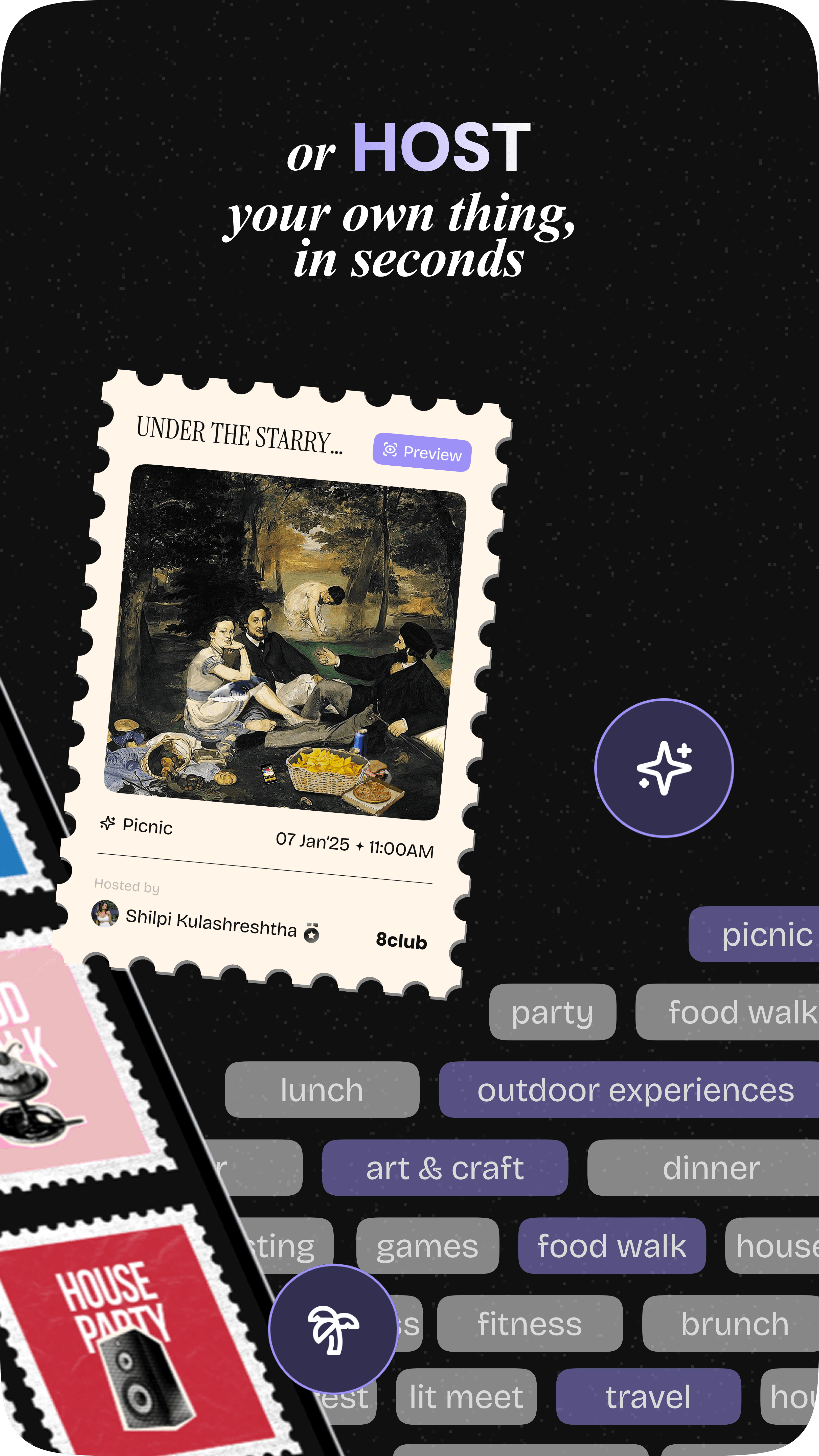
Instead of using generic categories or flat UI icons, each experience was turned into a collectable stamp system inspired by vintage postage marks, travel memorabilia, and old-world ephemera.

The stamp format was chosen deliberately. Stamps historically represent movement, journeys, discovery, and collecting, ideas deeply connected to how people experience cities, friendships, and spontaneous plans. The rough textures and imperfect cut edges helped the product feel human and tactile rather than overly polished or corporate.


Meanwhile, assigning every category its own distinct visual identity improved recognition across the product while still maintaining consistency within the larger ecosystem. This system eventually became the visual backbone of the product, appearing across onboarding, invites, hotspots, app previews, social content, and in-product storytelling.

Reimagining
Classical Paintings
Into Hotspots

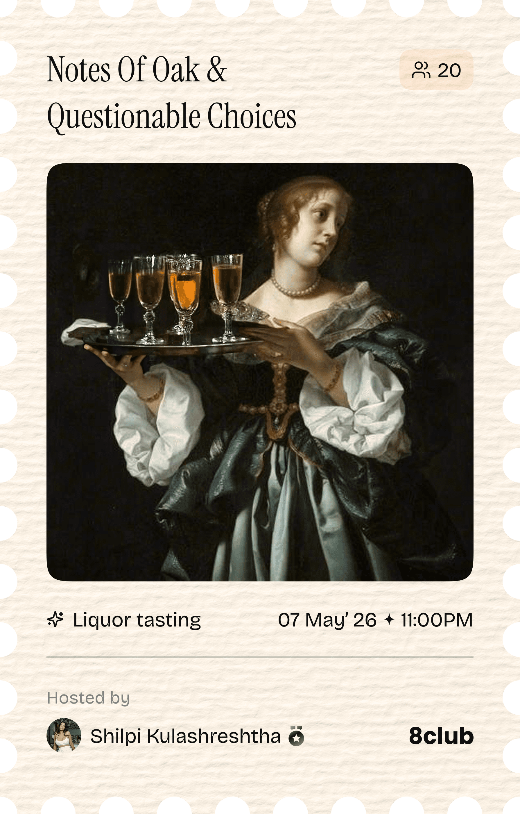
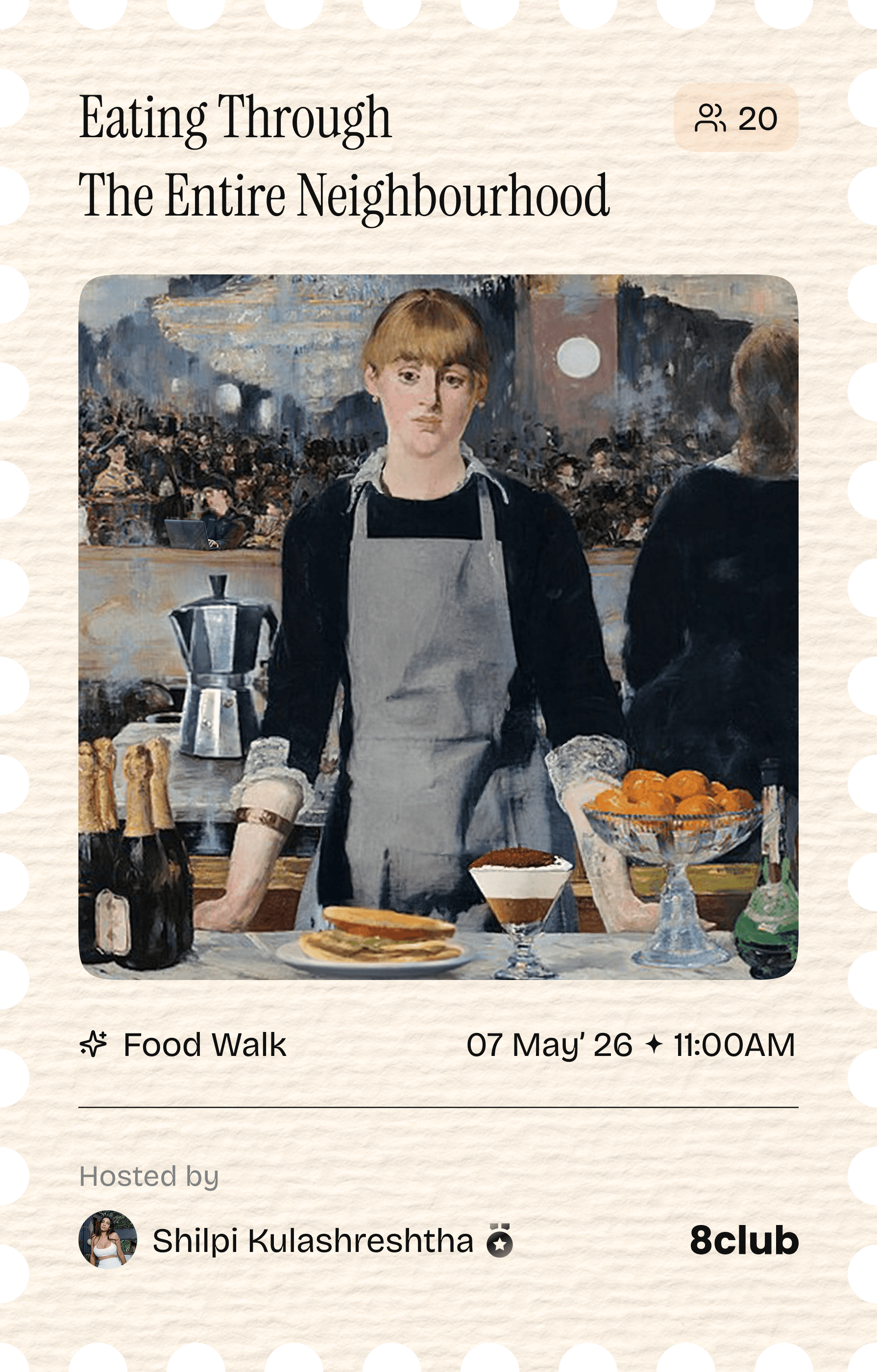
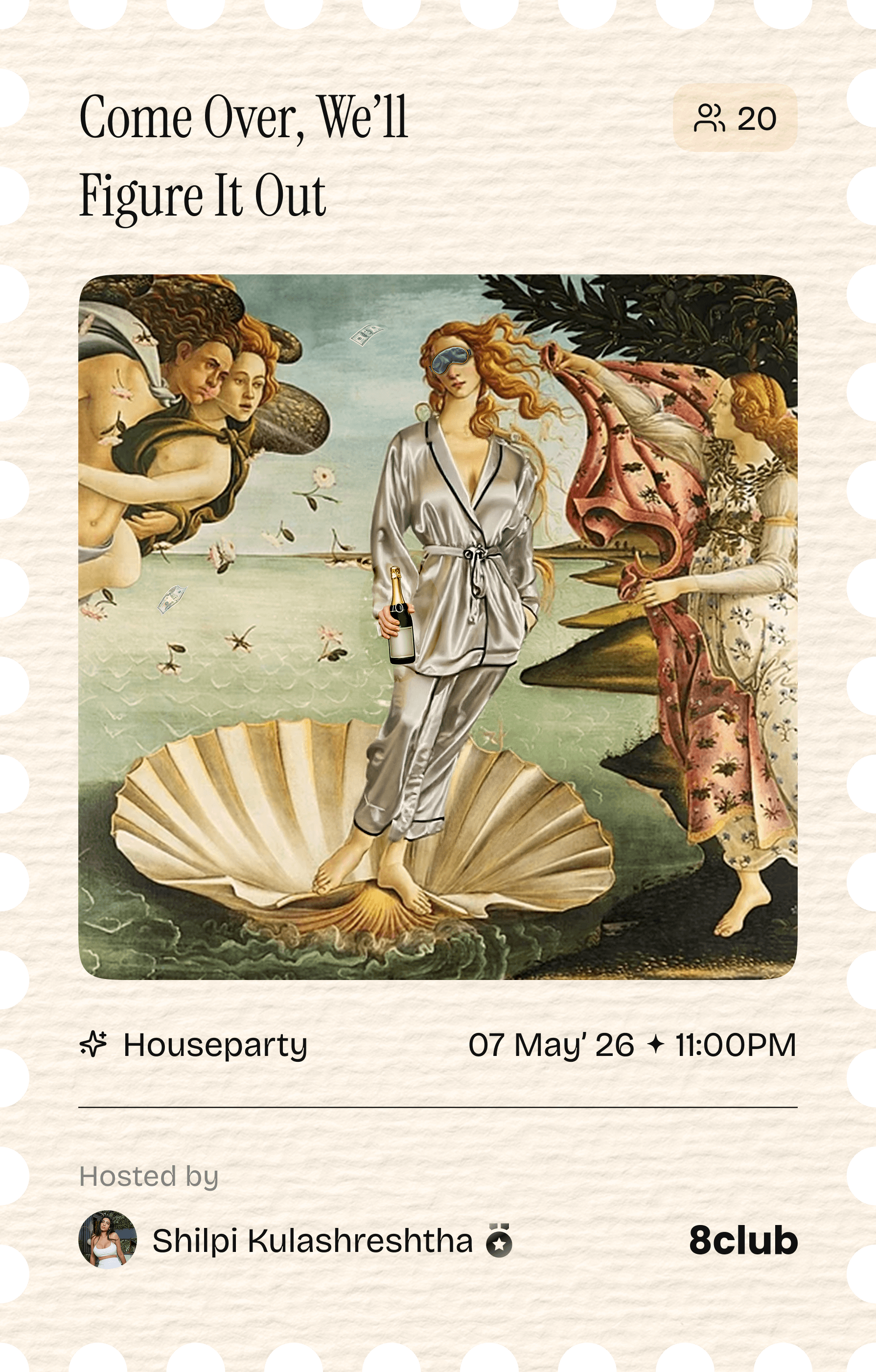
The hotspot banners were designed to feel cinematic instead of transactional. Classical paintings became the starting point because they already carried emotion, celebration, intimacy, movement, and chaos, the same emotions tied to social gatherings.


Instead of simply referencing them, the paintings were manually rebuilt and reimagined in Photoshop to fit modern experiences. The contrast between historical paintings and modern social culture created visual tension that felt humorous, dramatic, and memorable while helping ordinary plans feel larger than they actually were.

Every composition was manually collaged, extended, retouched, and

art-directed before AI-assisted workflows became common.

Historic art.
Modern energy.

Close-up of joshua tree branches against a clear sky.
Pipe organ and chairs inside a grand church
Looking up at a grand domed ceiling with columns
Full moon rising over a dark, silhouetted mountain ridge.
A bottle of daisy perfume with floral accents.

Designing Discovery
Before Download

The App Store and Play Store previews were approached more like campaign posters than product walkthroughs. Instead of focusing only on features, the screens were designed to communicate mood, participation, spontaneity, and social identity before users even entered the product.


Layered editorial compositions, cinematic photography, floating interface elements, scrapbook-inspired layouts, and tactile textures helped create previews that felt socially alive rather than purely functional.


The objective was to make the product feel like a social atmosphere people wanted to belong to, not just another app to install.

Making Waiting
Feel Emotional

Making
Waiting
Feel
Emotional

Before hosting became openly accessible, the platform introduced a waitlist system for future hosts. Instead of treating onboarding states like cold system screens, each stage was designed as part of a larger emotional journey.


Four visual states were created for becoming a host, being under review, getting accepted, and being rejected with reapplication. Each screen used surreal collage imagery, symbolic objects, cinematic lighting, and editorial typography to transform status updates into narrative moments.


A floating treasure chest represented possibility, a cosmic clock visualized anticipation, and a reinterpretation of The Creation of Adam symbolized acceptance and belonging. Even rejection was softened through dreamlike compositions rather than rigid error-driven UI.


The intention was to make hosting feel aspirational instead of procedural, something people emotionally wanted to grow into rather than simply unlock.

Before hosting became openly accessible, the platform introduced a waitlist system for future hosts. Instead of treating onboarding states like cold system screens, each stage was designed as part of a larger emotional journey.


Four visual states were created for becoming a host, being under review, getting accepted, and being rejected with reapplication. Each screen used surreal collage imagery, symbolic objects, cinematic lighting, and editorial typography to transform status updates into narrative moments.


The intention was to make hosting feel aspirational instead of procedural, something people emotionally wanted to grow into rather than simply unlock.

Building The
Cutout World

As the visual language evolved, cutout imagery slowly became one of the strongest recurring motifs across the product. Inspired by scrapbooks, DIY posters, zines, internet collage culture, and printed textures, the system intentionally embraced rough edges, grain, halftones, grayscale imagery, and imperfect compositions.


Cats, arcade machines, traffic cones, speakers, and random objects became part of an expanding visual library that gave the product unpredictability and personality.


The imperfections themselves became important because they made the interface feel more human, playful, and socially alive instead of overly optimized and sterile.

( Next Project )

The Host Cookbook

( 04 )

First layer: Normal pixelation effectBase imagePixelated image
Year

2024 - 26

Scope

Product Visuals, Visual Storytelling, Art Direction

Role

Visual Designer,

Art Director

Can design make people care about experiences before they happen?

We spent years becoming extremely online. Plans started living in group chats, birthdays became Instagram stories, and “hanging out” slowly turned into sending each other reels from bed. Somewhere in between all of that, going out stopped feeling warm and started feeling performative.


8club was built around a much simpler idea: people still want to meet people. They still want messy dinners, awkward introductions, loud rooms, inside jokes, low batteries, blurry photos, and the feeling of going home late and tired because the night accidentally became good.


The visual language had to feel like that too.

  • Retro app screen mockup
  • Colorful interest tags UI
  • Social app phone mockup
  • Hotspot stamp grid layout
  • Dark mode states app screen
  • App screen collection
  • Phone on grass mockup
  • Outdoor activity default stamp
  • Social profile grid on phone
  • Default hotspot cards

( 04 )

( Next Project )

The Host Cookbook

First layer: Normal pixelation effectBase imagePixelated image

( Next Project )

The Host Cookbook

( 04 )

First layer: Normal pixelation effectBase imagePixelated image

Create a free website with Framer, the website builder loved by startups, designers and agencies.